How to master PERT Charts: simple steps for project success

Hannah

A PERT Chart (Program Evaluation Review Technique) helps teams schedule, organize, and coordinate tasks effectively. Unlike Gantt charts with their bar graph structure, PERT charts create a free-form network diagram that shows task dependencies clearly.
These visual project roadmaps help teams find the critical path—the longest sequence of dependent tasks that sets your project's minimum completion time. The chart reveals exactly how much time your team needs to complete the work to be done.
Want to become skilled at this powerful project planning technique? This piece will teach you how to create and use PERT charts. You'll also learn to create your own PERT charts using Xmind.
What is a PERT Chart and why it matters
A PERT chart serves as a network diagram that helps project managers create realistic schedules by coordinating tasks and estimating their durations through a systematic approach. The Program Evaluation and Review Technique shows a visual map of project tasks, their sequence, and dependencies.
Understanding PERT's simple elements

PERT uses a network diagram to show how project tasks flow and connect. This visual tool includes several key parts:
Nodes: Circles or rectangles that represent project milestones or events
Arrows: Directional lines connecting nodes that show tasks needed before reaching the next milestone
Time Estimates: PERT calculates three different time estimates for each task: optimistic (shortest possible), pessimistic (longest), and most likely (reasonable)
The expected time calculation follows this formula: Expected time = (Optimistic time + [4 × Most Likely time] + Pessimistic time)/6. This weighted average gives more realistic timelines than single estimates.
PERT Charts' role in project planning
PERT charts are a great way to get project planning insights. They help schedule project timelines accurately and identify the critical path—the longest chain of dependent tasks that sets the project's minimum duration.
PERT charts make task dependencies clear, which helps teams prevent delays through better planning. Project managers can easily spot which tasks need immediate attention during scheduling.
The analysis also improves resource allocation by highlighting potential bottlenecks. Complex projects with uncertain durations benefit from PERT's probability-based approach.
PERT's what-if analysis capability lets teams see how changes affect project outcomes. Teams can spot potential issues and find ways to work more efficiently.
How a PERT Chart works: components and flow
Creating effective PERT charts requires a solid grasp of their components and information flow.
Nodes and milestones explained
Nodes are the life-blood of PERT charts. These numbered circles or rectangles symbolize project milestones or events. Each node marks a crucial point where tasks begin or end. Nodes work in three main ways:
Merge events happen at the time multiple activities meet at one point
Burst events occur when multiple activities start from a single point
Merge and burst events combine these functions together
Arrows and task dependencies
Directional arrows between nodes show tasks needed to move the project forward. These arrows illustrate both sequence and dependencies between activities. PERT charts use several arrow types:
Directional arrows show tasks with dependencies that must follow a specific order
Divergent arrows indicate tasks that teams can complete simultaneously
Vectors include labels with task descriptions and time estimates
Critical path and slack time
The critical path shows the longest chain of dependent tasks in a project and determines the minimum completion time. Delays in critical path activities directly push back project deadlines. Slack time (or float) shows how long teams can delay a task without affecting the overall timeline. Tasks on the critical path have zero slack time.
Dummy activities and concurrent tasks
Dummy activities appear as dotted lines that show dependencies without using time or resources. These lines help clarify task relationships, especially in complex projects. Concurrent tasks run simultaneously through divergent arrows. Teams can identify opportunities to process tasks in parallel and reduce project duration.
Step-by-step guide: how to make a PERT Chart with Xmind
PERT charts don't need to be complicated. Xmind helps you visualize project dependencies and identify critical paths easily.
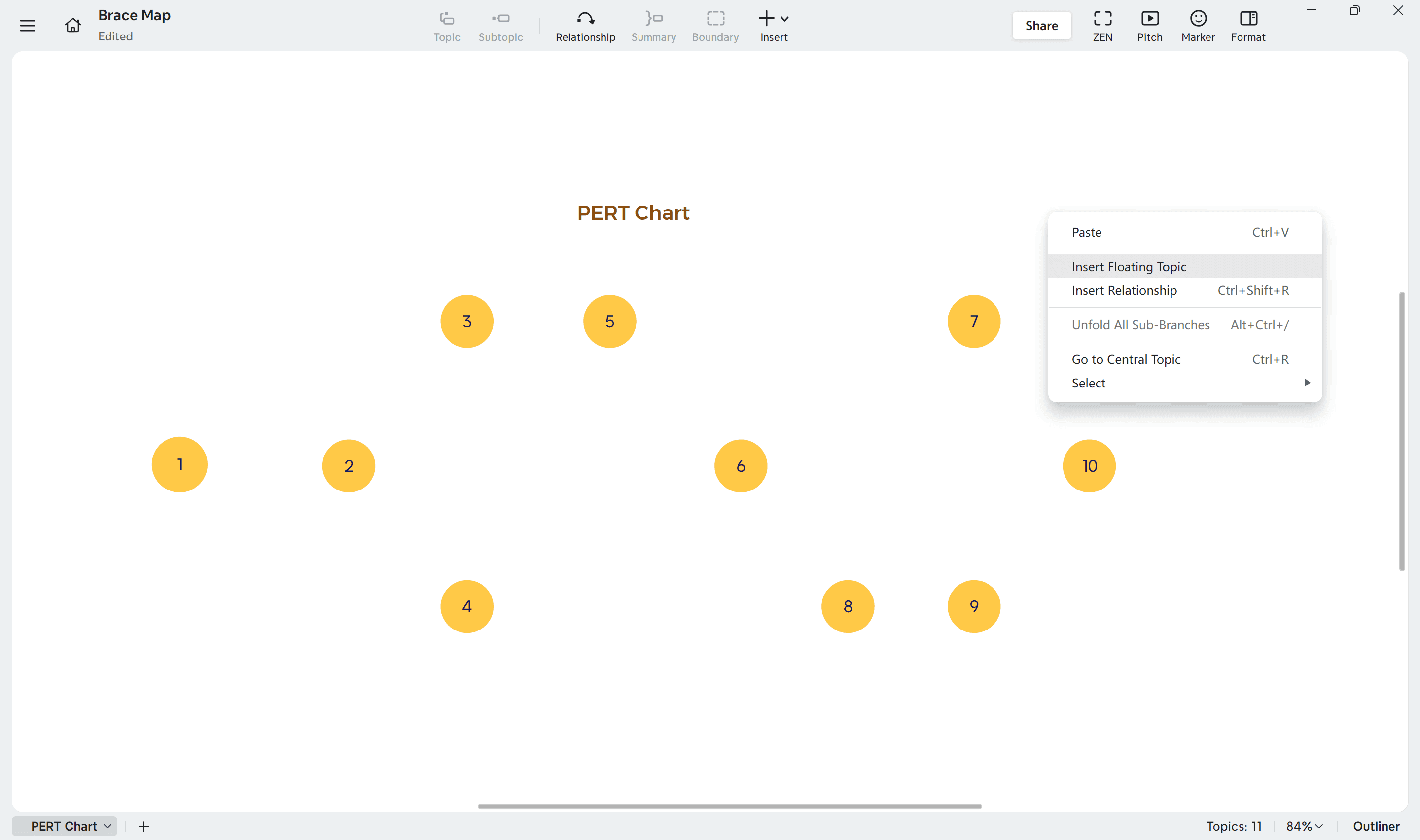
1. List all nodes
Start in Xmind by identifying all major nodes—each representing a key activity or milestone in your project.
Double-click on a blank area or insert “Floating Topic.”
Rename each node with a clear, descriptive title such as Design Hardware, Test Software, or Release Tutorials.
Drag and position nodes freely to arrange the logical flow of your project.
Keep nodes aligned in a way that supports readability, as this will make dependencies and relationships easier to follow later.
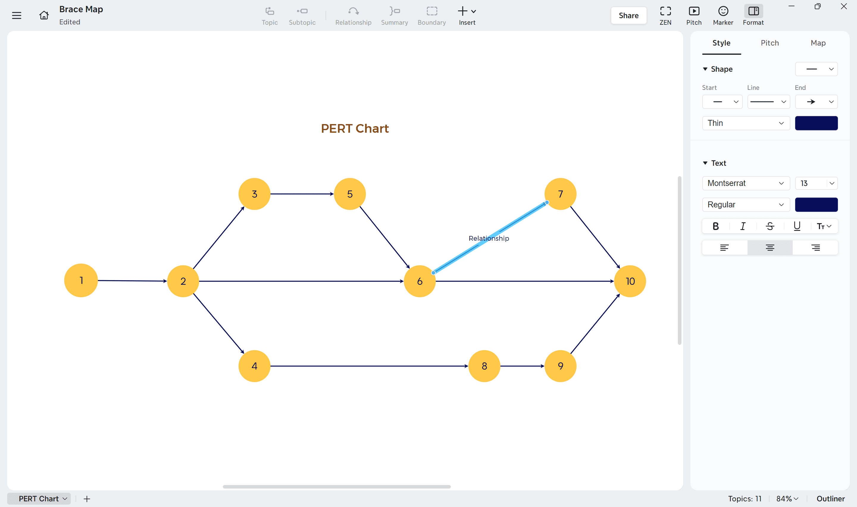
2. Connect nodes with Relationships
After placing all nodes, define their logical order using relationships.
To create them in Xmind:
Select a node that represents the starting activity.
Click the “Relationship” icon on the toolbar or right-click and choose Relationship.
Drag the arrow to the dependent node.
Each arrow shows a task dependency—which activity must be completed before another begins.
If certain tasks can run in parallel, create multiple outgoing arrows from a single node.
You can fine-tune the arrow’s angle or curvature through Format → Style → Line for a cleaner, more professional layout.
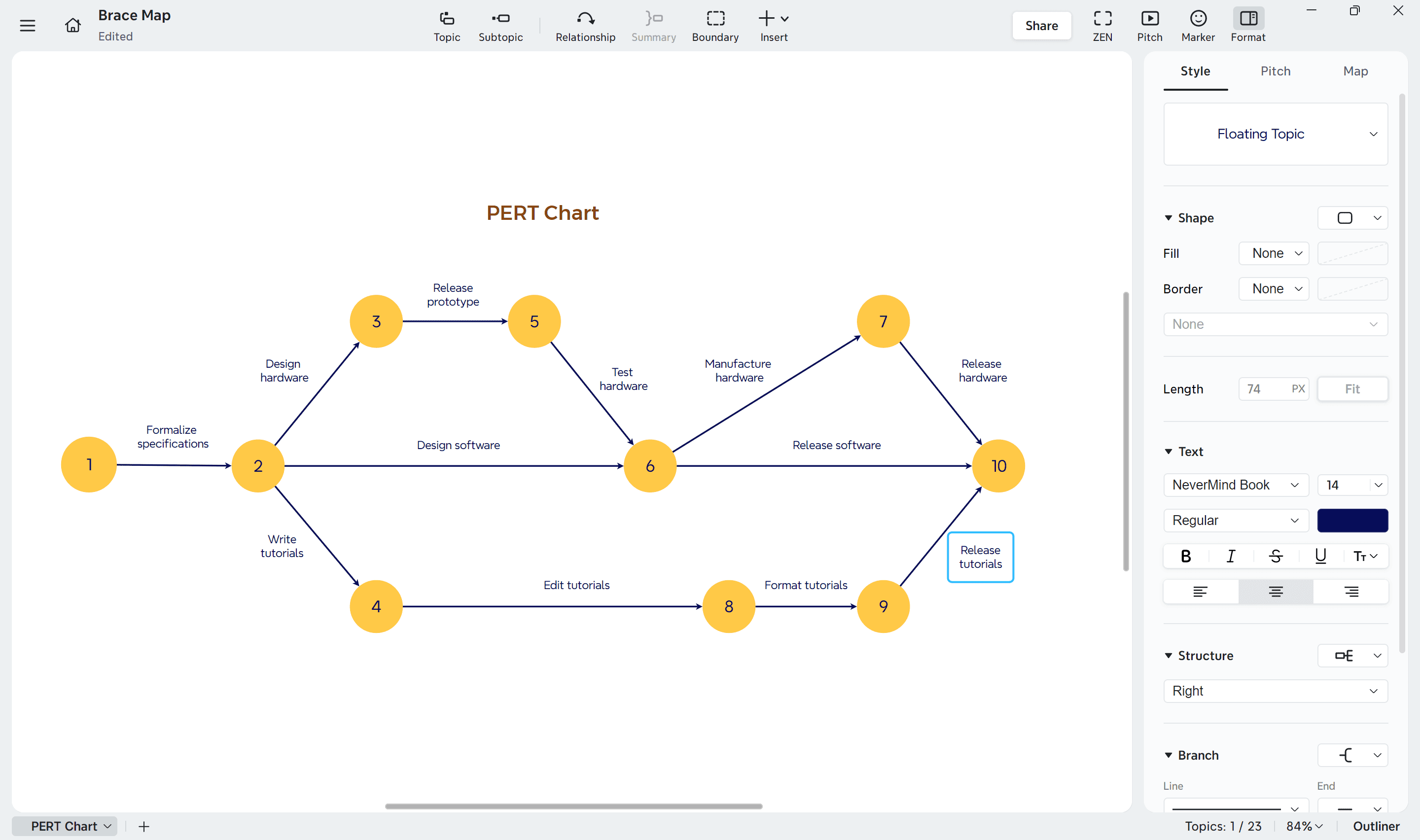
3. Label tasks on the connections
Each relationship line can include a label that explains the task or deliverable between nodes.
Double-click the arrow to add a label such as Release prototype or Test hardware.
Add time estimates or brief notes where helpful.
For time estimation, apply the PERT formula:
(Optimistic + 4 × Most likely + Pessimistic) ÷ 6
This helps you calculate the expected duration for each activity, producing a more accurate project schedule.
4. Add Markers for priority and status
Use markers in Xmind to indicate task importance, urgency, or completion status.
To add them:
Select a node or arrow and open the “Marker” panel on the right sidebar.
Choose symbols or colors to represent different levels of priority or progress.
For deeper tracking, right-click a node and choose “Task Info” to record start and end dates, expected duration, or completion percentage.
Establish a consistent visual system for your markers so your chart communicates priority and progress clearly across the team.
Using tools and PERT Charts templates
Project managers often use specialized tools to create PERT charts instead of building them from scratch.
How to use a PERT chart template effectively
Careful planning must precede the implementation of a PERT chart template. Your project scope needs clear definition and breakdown into manageable tasks. Team members and stakeholders should provide time estimates for each task. The final step involves picking a template that matches your project's complexity.
After selecting a template, customize it by:
Adding your milestone information
Connecting nodes to show dependencies
Including time estimates for each task
Marking and highlighting the critical path
Your completed template should live in a central location accessible to all team members, which improves collaboration naturally.
Best PERT chart creators and generators
These powerful tools make PERT chart creation easier:
All-in-one Mind Mapping and Project Visualization—Xmind: Xmind offers an intuitive way to create PERT charts through its visual mind mapping interface. Users can quickly build nodes and relationships to represent project tasks, dependencies, and milestones. The drag-and-drop structure allows for flexible layout adjustments, while built-in features such as Floating Topic, Relationship, Marker, and Task Info provide clear visualization of timelines, priorities, and progress. Xmind also supports converting maps into timeline or Gantt views, helping teams move seamlessly from concept planning to execution tracking—all in one workspace.
Integrated Project Management Tools: ProjectManager and ClickUp provide detailed features with automatic calculations for time estimates and critical paths.
Diagramming Software: Lucidchart and SmartDraw come with user-friendly interfaces, drag-and-drop functionality and extensive template libraries.
Microsoft Solutions: Visio and Excel include PERT chart capabilities that blend well with other Microsoft products.
The right tool choice depends on customization options, integration capabilities, collaboration features, and affordable pricing for your projects.
Conclusion
PERT charts will change how you handle project management. This piece shows how these powerful network diagrams help teams see dependencies, set realistic timelines, and spot critical paths that lead to success. These charts are different from other project management tools because they use a three-point system to account for time variations.
Note that PERT charts need regular updates as your project moves forward. These updates keep your planning accurate and relevant through the project's lifecycle. On top of that, it lets you run what-if scenarios to get ready for challenges ahead.
PERT charts give you the clarity to handle multiple moving parts in complex software development, construction projects, or product launches. Want to make your project planning smoother? Xmind's user-friendly tools help create dynamic PERT charts that will improve your project management skills. The right visualization tools will help you deliver projects on time with confidence.
FAQs
Q1. What is the three-point estimation method in PERT?
The three-point estimation method in PERT involves calculating the expected task duration using three time estimates: optimistic (shortest possible time), pessimistic (longest time), and most likely (reasonable estimate). The formula is: Expected time = (Optimistic + 4 × Most Likely + Pessimistic) / 6.
Q2. How does a PERT chart differ from a Gantt chart?
While both are project management tools, PERT charts are network diagrams that focus on task dependencies and critical path analysis. Gantt charts, on the other hand, are bar graphs that primarily show task durations and schedules. PERT charts are more suitable for complex projects with uncertain timelines.
Q3. What are the benefits of using PERT charts in project management?
PERT charts help visualize task dependencies, estimate realistic timelines, identify the critical path, and conduct what-if analyzes. They also aid in resource allocation, bottleneck identification, and provide a probabilistic approach to project scheduling, making them valuable for complex projects with uncertain durations.


