Native, but unified: how Xmind thinks about cross-platform design

Hannah

If you use Xmind on more than one device, you've probably felt something—a small friction when switching platforms. The buttons look slightly different. An interaction doesn't behave the way you expected. Nothing's broken, but something feels like it wasn't quite made for here.
We felt it too. So we made a decision: Xmind should feel native on every platform—not just functional, but genuinely at home on macOS, Windows, iOS, and Android. Same core structure, same logic, same feel of the product you know—but wearing the right clothes for wherever it's running.
This is how we did it.
The problem with most cross-platform apps
Here's the typical approach: build one UI, ship it everywhere. It's cheaper, faster, and keeps things consistent. Most apps do this—and honestly, most users put up with it.
The result is an app that works on every platform but feels native to none:
Mac users notice it doesn't look like other Mac apps.
Android users notice it's clearly a port from iOS.
Nobody complains loudly, but the friction quietly adds up.
The alternative—designing separately for each platform—sounds right but almost never happens. It costs too much, takes too long, and teams maintaining four different designs eventually burn out and converge anyway.
We weren't happy with either option. So we looked for a different way to think about it.
Same app, different outfit
Think about how a person dresses. Suit at a formal meeting, casual on the weekend, gym clothes on Saturday morning. Three different looks—but you recognize them instantly every time. Because their identity isn't in the clothes. It's in how they carry themselves, how they talk, how they treat people.
Xmind works the same way. Not everything should be consistent across platforms—but the right things always are.
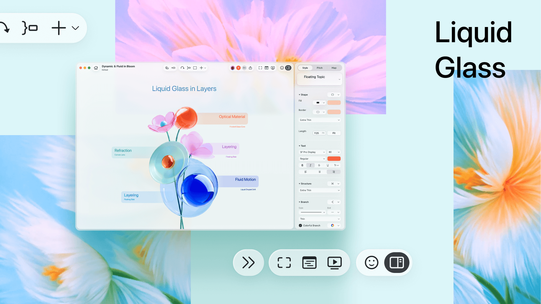
What changes: the surface

Button shapes, materials, animations, even the tone of the copy—these follow each platform's own conventions completely.
Platform | What it looks like |
|---|---|
macOS | Pill-shaped buttons, Liquid Glass panels that float above the canvas, generous breathing room |
Windows | Geometric, restrained rounded rectangles, native title bar, direct copy ("Upgrade" not "Upgrade Now") |
iOS & iPadOS | Fully updated on day one of every major OS release—when you upgrade, Xmind already belongs to the new system |
Android | Rebuilt around Material Design 3—gestures, transitions, and panel behavior recalibrated to match how Android users actually move |
This sounds like more work because it is. But it's the only way Xmind can feel like it belongs on each platform, rather than just running on it.
What stays: the structure
Where the tools live, how features are organized, how you navigate between maps—this stays exactly the same, everywhere.
Navigation at the top. Canvas in the center. Properties panel on the side on desktop, sliding up from the bottom on mobile. Map tabs along the bottom.
Switch from Mac to iPad and you don't need to relearn anything. The app looks different, but it works like the Xmind you already know. That consistency—invisible when it's working—is what lets the surface change freely without users ever feeling lost.
What never moves: the core
Underneath everything, a few things stay fixed regardless of platform or whatever new design language Apple or Google invents next:
The canvas is always the main character. UI steps back.
Complex features are there when you need them and out of the way when you don't.
Undo is unlimited—creative work requires the freedom to try things without worrying about breaking them.
Fast beats beautiful, every time. No animation or visual detail is worth making the app feel slower.
These aren't design decisions. They're closer to promises.
The reason we can maintain all of it
After reading all of this, a fair question is: four platforms, four visual languages, different conventions everywhere—how do you actually manage that without the whole thing falling apart?
Two years ago, we made a decision that felt non-urgent at the time: build a proper design system for Xmind.
The core problem it solves is simple to explain but surprisingly hard to do: absorb every platform difference in one place, so the rest of the product doesn't have to care. The same button exists once in our system. On macOS it becomes a pill. On Windows it becomes a rounded rectangle. One change, everywhere—no hunting through files, no fixing the same thing four times, no slowly drifting out of sync.
Without that foundation, none of what we've described would be sustainable. Every update becomes a negotiation about which platforms get the fix this sprint. Every new feature spawns four slightly different versions that gradually stop feeling like the same product. Eventually, everyone quietly agrees it's too expensive to keep up—and the whole thing converges back to a single UI shipped everywhere.
The design system is what makes doing the right thing not just possible, but repeatable.
You'll never notice it directly. That's exactly the point.
Conclusion
A new Xmind is coming.
It looks better. But the more honest description is: they're the result of two years of work that wasn't always obvious from the outside—learning each platform properly, building the foundation to maintain it, and staying committed to the idea that you shouldn't have to compromise just because you use more than one device.
We use Xmind every day, across different devices. We can't stand experiences that just "get by." So we don't want you to have to, either.


