Turn your syllabus into a course map that shows how the course works

Hannah

A syllabus may contain every required detail and still leave the course difficult to see. Learning outcomes sit near the top. Assessments appear several pages later. Weekly topics occupy a table. Readings live in the learning platform, while lesson activities wait in separate notes or slide decks.
Each item is present. Their relationships are harder to inspect.
That gap becomes obvious during teaching preparation. You reach week five and realize an assignment expects a skill that students have practiced only once. A reading introduces a concept after the class discussion that depends on it. Two demanding assessments land close together because they were planned in different sections of the document.
A course map brings those relationships into one view. Instead of treating the syllabus as the final planning surface, use it as the source material for a visual system that connects outcomes, content, activities, assessments, and time.
👉 Start with this free syllabus template, then build it into a course map.
Build the course from outcomes to daily teaching decisions
Begin with the decisions that shape the whole course, then let detail appear in layers. The first map does not need polished wording or complete lesson plans. It needs to reveal whether the course has a clear direction and whether each major part supports that direction.
Put the destination above the calendar
Place the course purpose or central promise at the center of the map. Add the learning outcomes as main branches, phrased around what students should understand, create, analyze, or demonstrate by the end.
Then connect each outcome to evidence. What assignment, performance, project, discussion, or exam will let students demonstrate it? If an outcome has no corresponding evidence, it may be too vague or disconnected. If a major assessment points to no outcome, its role in the course may need another look.
This view keeps the calendar from making the first decision. A familiar week-by-week sequence can feel orderly while hiding a weak learning path. Begin with where students are going, then decide how the weeks should carry them there.
Let modules form meaningful learning arcs
Once the destination is visible, group the course into modules. A module can represent a concept, question, case, method, problem, or phase of practice. Give each one a clear purpose rather than using it only as a container for several weeks.
Under every module, connect the content students will encounter with the work they will do. A branch might move from a core question to a reading, a short explanation, a classroom activity, a practice task, and an assessment checkpoint. The map makes it easier to spot a module full of content but short on practice, or a busy week whose activities do not advance the intended outcome.
Keep the module map readable. Detailed instructions, source notes, and backup activities can sit on child branches or in notes until they are needed. The upper levels should still let you scan the course in a few moments.
Turn each module into teachable sessions
When the semester approaches, expand the nearest module into daily plans. A class meeting might include an opening question, a concept explanation, an example, guided practice, an independent task, and a closing check. Another might begin with a case and allow the theory to emerge afterward.
The sequence should follow the teaching logic, not a fixed template. What matters is that you can see the movement of the class and locate the materials, activities, and follow-up connected to each moment.
This layered approach keeps a daily lesson from becoming an isolated document. When you adjust one activity, you can still see the module and outcome it is meant to support.
Match the Xmind structure to the teaching question
Different parts of a course need different visual arrangements. A radial mind map can hold the whole course around its central purpose. A logic chart can show the hierarchy from outcomes to modules and lessons. A timeline can make the sequence of teaching weeks visible.
Xmind's Structure options allow multiple structures to coexist in one map. That means one branch can show the course hierarchy while another shows a chronological teaching sequence. You do not need to flatten every planning question into the same layout.
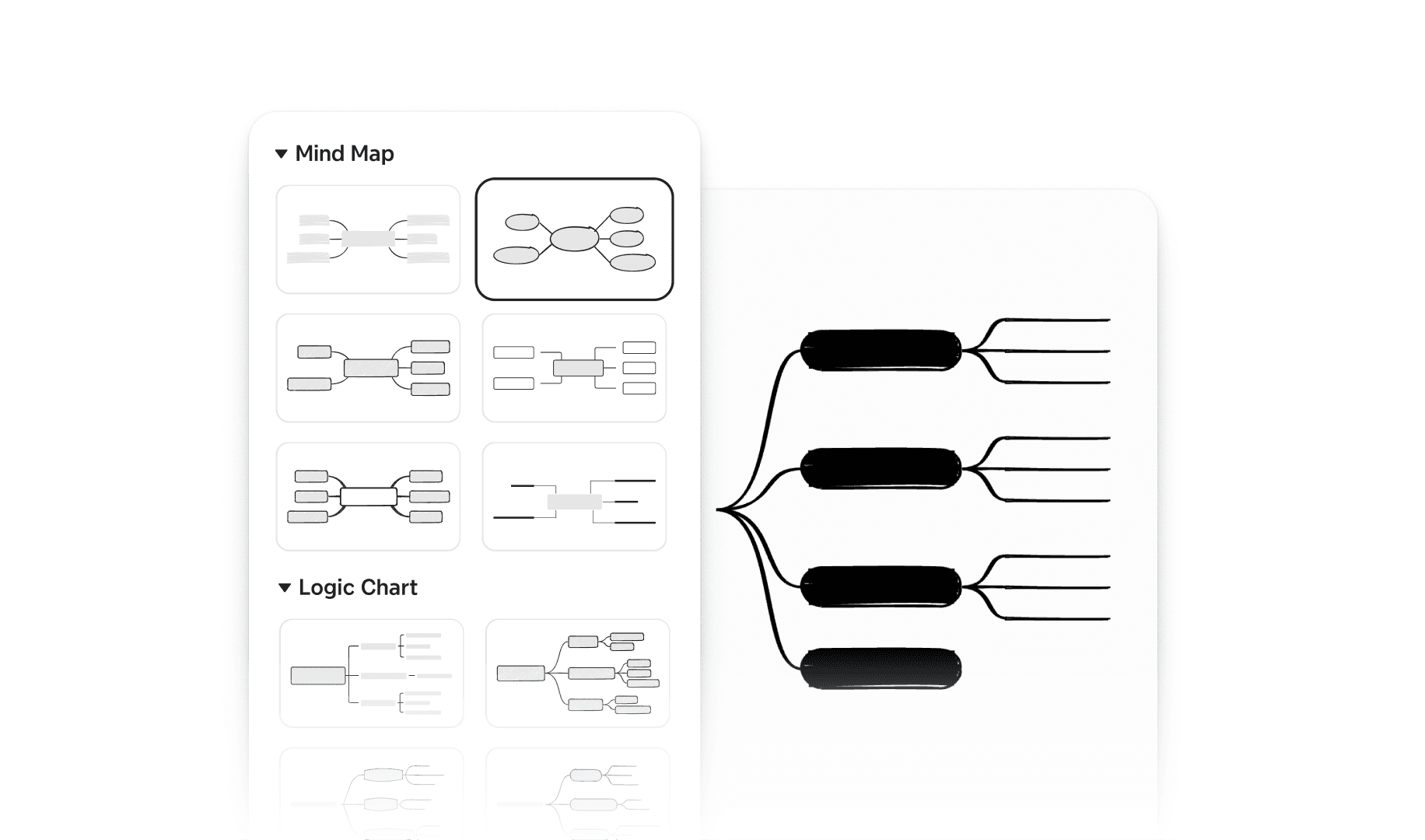
Choose structure according to the decision in front of you:
Use a broad mind map when you need to see balance across outcomes, modules, assessments, and resources.
Use a timeline when order, pacing, or date-sensitive activities matter most.
Use a logic or tree-style structure when you need to move from a large course component into its supporting details.
Mix structures when the course needs both conceptual and chronological views.
The visual treatment should make the course easier to reason about. If colors, markers, or branches do not help you notice alignment, workload, sequence, or readiness, they do not need to be there.
Teach from the map instead of rebuilding the lesson
The hour before class is a poor time to discover that your teaching plan and presentation have drifted apart. One document says the discussion comes first. The slides put the example first. A final note reminds you to ask a question that appears nowhere in either place.
Pitch Mode can turn an Xmind map into a presentation, using its topics as the basis for slides. You can control which topics appear, choose layouts and delivery modes, and use Presenter View to check the presentation alongside the mind map.
For a course designed in Xmind, that creates a shorter path from preparation to delivery. A module branch can become the lesson's presentation flow. An example or activity can remain connected to the concept it supports. When the lesson changes during preparation, you update the map that also carries the presentation instead of reconciling another slide deck.
Do a quick presentation pass before class. Hide planning branches students do not need to see, check the order of visible topics, and make sure each transition supports the lesson rather than merely following the shape of the map.
Reuse the course without freezing last semester in place
A reusable course map should preserve the thinking that worked while leaving room for a different group of students. Keep one clean master map, then duplicate it before the next term. Retain the outcomes, module logic, successful activities, and assessment relationships. Review the pacing, examples, readings, and daily plans with fresh eyes.
Small teaching notes become more valuable when they remain attached to the right branch. After class, add a brief observation where it belongs: discussion needed ten more minutes, instructions were unclear, example worked well, or prerequisite knowledge was missing. By the end of the term, the map holds a practical record of where the course needs adjustment.
Review it at three useful moments:
Before the semester: Check alignment, workload, dates, and missing materials.
After each class: Capture only the observation that could improve the next session or future version.
After each module: Decide what to keep, move, shorten, expand, or replace.
The course stays recognizable from semester to semester, but it does not become a museum of old decisions.
Conclusion
Strong course design gives every outcome, activity, assessment, and lesson a reason to be where it is. A visual course map makes those reasons easier to inspect before students encounter the consequences, while Xmind keeps the plan flexible enough to follow the reality of the classroom.
Build your next course map in Xmind, teach from the same structure, and let each semester leave the plan clearer than it found it.
See the whole course before the first class
Turn your syllabus into a flexible visual teaching plan you can update, reuse, and present from Xmind.